
Spotify Unwrapped
Although Spotify provides a nice yearly wrap-up, as a data nerd getting hold of your raw dataset and doing your own analysis is a lot more fun. So here’s my take on my year in music.
Spoilers: no surprises who my top artists are.
The Data
Spotify makes data available to users via the Account Privacy page (see this support article for more info).
It takes a few days to generate a download archive but once it’s ready, you’ll get a zip file containing a bunch of json files as described by the Spotify data dictionary
StreamingHistory0.json contains my streaming history for the year and it’s this file I’ll be basing my report on.
Data Prep
First stage of any data exploration is to get familiar with the source data. Opening StreamingHistory0.json in Power BI / Power Query gives:
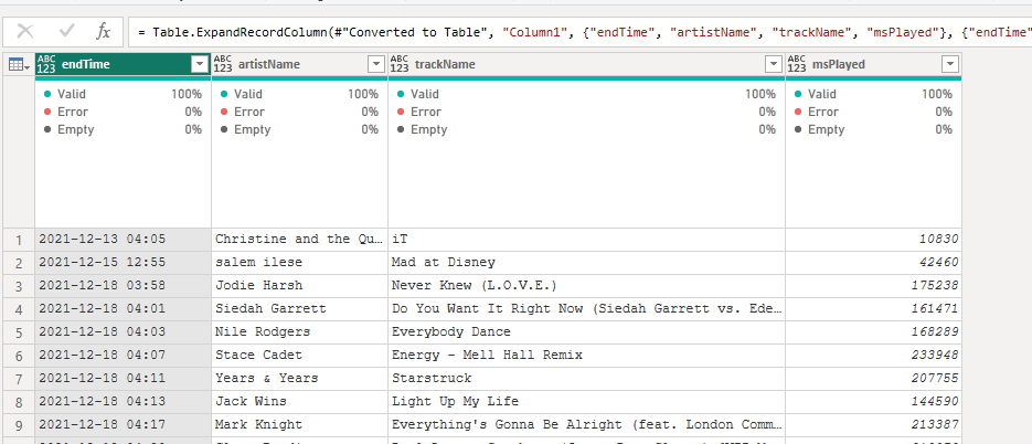
Some things to note.
- The data is in a single transaction file and will need to be transformed into a star schema.
- The
endTimeis in UTC but has no timezone information. - There are no keys to identify the artists or tracks uniquely.
- Time played
msPlayedis in milliseconds. - Overall, the data looks fairly clean; there are no error rows, no nulls etc.
Data Prep - Base Data Load
First, let’s start with tweaking the default M code generated by Get Data. When working with local file data, it’s always a good idea to parameterise paths. I’ll be using the parameter DataFolder for this.
let
    Source = Json.Document(File.Contents( DataFolder  & "\my_spotify_data\MyData\StreamingHistory0.json")),
    #"Converted to Table" = Table.FromList(Source, Splitter.SplitByNothing(), null, null, ExtraValues.Error),
    #"Expanded Column1" = Table.ExpandRecordColumn(#"Converted to Table", "Column1", {"endTime", "artistName", "trackName", "msPlayed"}, {"endTime", "artistName", "trackName", "msPlayed"}),
Next to add timezone information to the endTime column. I’ll use the DateTimeZone.AddZone and DateTimeZone.ToLocal functions to do this:
#"Add Local Timezone" = Table.TransformColumns(#"Expanded Column1", { {"endTime", each DateTimeZone.ToLocal(DateTime.AddZone( DateTime.FromText(_) , 0)), type datetimezone } }),
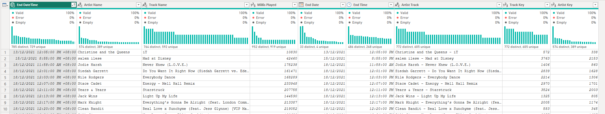
General housekeeping - fix up some types, rename the columns to something more meaningful and split the endDate into Date and Time to make the data easier to work with later (separate columns also compress better due to lower cardinality, but for these volumes this isn’t an issue):
    #"Change Types" = Table.TransformColumnTypes(#"Add Local Timezone",{ {"artistName", type text}, {"trackName", type text}, {"msPlayed", Int64.Type}}),
    #"Renamed Columns" = Table.RenameColumns(#"Change Types",{{"endTime", "End DateTime"}, {"artistName", "Artist Name"}, {"trackName", "Track Name"}, {"msPlayed", "Millis Played"}}),
    #"Add End Date" = Table.DuplicateColumn(#"Renamed Columns", "End DateTime", "End Date"),
    #"Add End Time" = Table.DuplicateColumn(#"Add End Date", "End DateTime", "End Time"),
    #"Changed Date Time Types" = Table.TransformColumnTypes(#"Add End Time",{{"End Time", type time}, {"End Date", type date}}),
Star Schemaifying - Preping for Fact & Dimension Queries
We’ll need to split the data into dimensions (Track, Artist, Date/Time) and facts (Streams). To achieve this, we’ll need to add surrogate keys for the dimensions.
I’m going to use a compound key for the Track and Artist to identify the unique combination in order to generate an index. (Turns out I’m going to need this column in a visual later anyway.)
#"Add Compound ArtistTrack Key" = Table.AddColumn(#"Changed Date Time Types", "Artist Track", each Text.Combine({[Artist Name], [Track Name]}, " - "), type text),
This may or may not be the best way to do this next bit.
To add a surrogate key for Artists and Tracks, I’m going to use Table.Distinct to get a list of unique Artist Track values, Table.AddIndexColumn to add the index and Table.NestedJoin to join the Artist Track column back to the original data. This will give me a Track Key column with the surrogate key for each unique Artist-Track.
        #"Distinct Artist Track" = Table.Distinct(Table.SelectColumns(#"Add Compound ArtistTrack Key", {"Artist Track"})),
        #"Sorted Rows" = Table.Sort(#"Distinct Artist Track",{{"Artist Track", Order.Ascending}}),
        #"Added Track Index" = Table.AddIndexColumn(#"Sorted Rows", "Index", 1, 1, Int64.Type),
    #"Merged Track Query" = Table.NestedJoin(#"Reordered Columns" , {"Artist Track"}, #"Added Track Index", {"Artist Track"}, "Track", JoinKind.LeftOuter),
    #"Expanded Track" = Table.ExpandTableColumn( #"Merged Track Query", "Track", {"Index"}, {"Track Key"}),
And a similar approach for the Artist dimension:
        #"Distinct Artist" = Table.Distinct(Table.SelectColumns(#"Reordered Columns", {"Artist Name"})),
        #"Sorted Artists" = Table.Sort(#"Distinct Artist",{{"Artist Name", Order.Ascending}}),
        #"Added Artist Index" = Table.AddIndexColumn(#"Sorted Artists", "Index", 1, 1, Int64.Type),
    #"Merged Artist Query" = Table.NestedJoin(#"Expanded Track" , {"Artist Name"}, #"Added Artist Index", {"Artist Name"}, "Artist", JoinKind.LeftOuter),
    #"Expanded Artist" = Table.ExpandTableColumn( #"Merged Artist Query", "Artist", {"Index"}, {"Artist Key"})
Final Query
Here’s the complete Power Query to load the StreamingHistory0.json file:
let
    Source = Json.Document(File.Contents( DataFolder  & "\my_spotify_data\MyData\StreamingHistory0.json")),
    #"Converted to Table" = Table.FromList(Source, Splitter.SplitByNothing(), null, null, ExtraValues.Error),
    #"Expanded Column1" = Table.ExpandRecordColumn(#"Converted to Table", "Column1", {"endTime", "artistName", "trackName", "msPlayed"}, {"endTime", "artistName", "trackName", "msPlayed"}),
    #"Add Local Timezone" = Table.TransformColumns(#"Expanded Column1", { {"endTime", each DateTimeZone.ToLocal(DateTime.AddZone( DateTime.FromText(_) , 0)), type datetimezone } }),
    #"Change Types" = Table.TransformColumnTypes(#"Add Local Timezone",{ {"artistName", type text}, {"trackName", type text}, {"msPlayed", Int64.Type}}),
    #"Renamed Columns" = Table.RenameColumns(#"Change Types",{{"endTime", "End DateTime"}, {"artistName", "Artist Name"}, {"trackName", "Track Name"}, {"msPlayed", "Millis Played"}}),
    #"Add End Date" = Table.DuplicateColumn(#"Renamed Columns", "End DateTime", "End Date"),
    #"Add End Time" = Table.DuplicateColumn(#"Add End Date", "End DateTime", "End Time"),
    #"Changed Date Time Types" = Table.TransformColumnTypes(#"Add End Time",{{"End Time", type time}, {"End Date", type date}}),
    #"Add Compound ArtistTrack Key" = Table.AddColumn(#"Changed Date Time Types", "Artist Track", each Text.Combine({[Artist Name], [Track Name]}, " - "), type text),
    #"Reordered Columns" = Table.ReorderColumns(#"Add Compound ArtistTrack Key",{"End DateTime", "End Date", "End Time", "Artist Track", "Artist Name", "Track Name", "Millis Played"}),
        #"Distinct Artist Track" = Table.Distinct(Table.SelectColumns(#"Reordered Columns", {"Artist Track"})),
        #"Sorted Rows" = Table.Sort(#"Distinct Artist Track",{{"Artist Track", Order.Ascending}}),
        #"Added Track Index" = Table.AddIndexColumn(#"Sorted Rows", "Index", 1, 1, Int64.Type),
    #"Merged Track Query" = Table.NestedJoin(#"Reordered Columns" , {"Artist Track"}, #"Added Track Index", {"Artist Track"}, "Track", JoinKind.LeftOuter),
    #"Expanded Track" = Table.ExpandTableColumn( #"Merged Track Query", "Track", {"Index"}, {"Track Key"}),
        #"Distinct Artist" = Table.Distinct(Table.SelectColumns(#"Reordered Columns", {"Artist Name"})),
        #"Sorted Artists" = Table.Sort(#"Distinct Artist",{{"Artist Name", Order.Ascending}}),
        #"Added Artist Index" = Table.AddIndexColumn(#"Sorted Artists", "Index", 1, 1, Int64.Type),
    #"Merged Artist Query" = Table.NestedJoin(#"Expanded Track" , {"Artist Name"}, #"Added Artist Index", {"Artist Name"}, "Artist", JoinKind.LeftOuter),
    #"Expanded Artist" = Table.ExpandTableColumn( #"Merged Artist Query", "Artist", {"Index"}, {"Artist Key"})
in
    #"Expanded Artist"
Fact and Dimension Queries
Now we have a base query, we can create the queries for the fact and dimension tables quite simply by referencing our base query and removing the columns/rows we don’t need.
A Note on Reference vs Duplicate Queries
Regardless of whether you use a reference or duplicate the query, the query logic executes for each query. Reference queries are useful when you want to share the same query logic across multiple queries but there is no data caching (kinda, PQ caching is an art best not dabbled in).
See https://learn.microsoft.com/en-us/power-bi/guidance/power-query-referenced-queries
Track Dimension Query
let
    Source = StreamingHistory0,
    #"Removed Columns" = Table.RemoveColumns(Source,{"End DateTime", "End Date", "End Time", "Artist Name", "Millis Played"}),
    #"Removed Duplicates" = Table.Distinct(#"Removed Columns", {"Track Key"}),
    #"Reordered Columns" = Table.ReorderColumns(#"Removed Duplicates",{"Track Key", "Track Name", "Artist Track", "Artist Key"})
in
    #"Reordered Columns"
Artist Dimension Query
let
    Source = StreamingHistory0,
    #"Removed Columns" = Table.RemoveColumns(Source,{"End DateTime", "End Date", "End Time", "Track Name", "Millis Played", "Track Key", "Artist Track"}),
    #"Reordered Columns" = Table.ReorderColumns(#"Removed Columns",{"Artist Key", "Artist Name"}),
    #"Removed Duplicates" = Table.Distinct(#"Reordered Columns", {"Artist Key"})
in
    #"Removed Duplicates"
Stream Fact Query
let
    Source = StreamingHistory0,
    #"Removed Columns" = Table.RemoveColumns(Source,{"End DateTime", "Artist Name", "Track Name", "Artist Key"})
in
    #"Removed Columns"
Date and Time Dimensions
There are literally dozens of examples online of how to create date and time dimensions in Power Query. I used this example from Radacad.
Report Design
Vispiration
Not being a professional designer, report design is not my natural strong point. So some research for vispiration is in order. One of my favourite places to look for inspiration is r/dataisbeautiful and here are some of the examples I’ve drawn from:
https://www.reddit.com/r/dataisbeautiful/comments/wt7b3n/oc_most_streamed_artists_on_spotify_all_time/
 I really like this vis, and it would be an interesting challenge to produce something similar in Deneb.
https://www.reddit.com/r/dataisbeautiful/comments/rpmxg5/oc_analysis_of_my_own_spotify_personal_data/
 The Spotify colour palette is popular, and this is one of many examples of green, white and black.
https://www.reddit.com/r/dataisbeautiful/comments/z8xll5/every_year_for_spotify_wrapped_day_i_design_a/
 Another nice use of artist images and a great colour palette but not the vibe I’m going for.
https://www.reddit.com/r/dataisbeautiful/comments/wi13wp/oc_the_most_streamed_spotify_songs_of_alltime/
 Again, artist photos are my takeaway from this one.
Design Decisions
So from my brief research I’ve decided to incorporate:
- Spotify inspired colour palette
- Artist Images
- Deneb Custom visuals inspired by the first example above.
Additional Data - Images
I’m going to need some images of my fav artists for my report. Time to iterate back to the data model.
Plan A - Image Search
The first idea I had was to automate a Bing Image Search for each artist name. Calling a REST Endpoint from Power Query is pretty straightforward, and the Bing Image Search API is well documented.
(query) =>
let
    url = "https://api.bing.microsoft.com/v7.0/images/search",
    options = [Headers=[#"Ocp-Apim-Subscription-Key"="<your-key>"], Query = [q = query, count="1"] ],
    result = Json.Document(Web.Contents(url , options)),
    value = result[value],
    value1 = value{0}[contentUrl]
in
    value1
However, I have around 2200 artists in my data set, and I didn’t fancy calling the API that many times (especially considering I probably wont need every artist image). Not to mention I’d hit my Search SKU API quota. That calls for plan B.
Plan B - Image Import
I’d already decided I would only be displaying top 5 results for artists, so I could just spend 10 mins and run a Bing search with the ‘public domain’ filter set to find suitable images. Files were resized and cropped to a circle in paint.net. Manual but effective.
Design is obviously iterative; my top 5 artists were discovered during initial data exploration.
In order to include these in my dataset, I went with Chris Webb’s approach (see this blog post on including images in Power BI datasets). The limit of 2M chars per DAX measure wouldn’t be an issue as my images will be less than 100K.
Here’s my very slightly modified version of Chris’s code:
let
    //Get list of files in folder
    Source = Folder.Files(DataFolder& "\Artist Images"),
    #"Filtered Rows" = Table.SelectRows(Source, each Text.EndsWith([Name], ".png")),
    //Remove unnecessary columns
    RemoveOtherColumns = Table.SelectColumns(#"Filtered Rows",{"Content", "Name"}),
    //Creates Splitter function
    SplitTextFunction = Splitter.SplitTextByRepeatedLengths(30000),
    //Converts table of files to list
    ListInput = Table.ToRows(RemoveOtherColumns),
    //Function to convert binary of photo to multiple
    //text values
    ConvertOneFile = (InputRow as list) =>
        let
            BinaryIn = InputRow{0},
            FileName = InputRow{1},
            BinaryText = Binary.ToText(BinaryIn, BinaryEncoding.Base64),
            SplitUpText = SplitTextFunction(BinaryText),
            AddFileName = List.Transform(SplitUpText, each {FileName,_})
        in
            AddFileName,
    //Loops over all photos and calls the above function
    ConvertAllFiles = List.Transform(ListInput, each ConvertOneFile(_)),
    //Combines lists together
    CombineLists = List.Combine(ConvertAllFiles),
    //Converts results to table
    ToTable = #table(type table[Name=text,Pic=text],CombineLists),
    //Adds index column to output table
    AddIndexColumn = Table.AddIndexColumn(ToTable, "Index", 0, 1),
    #"Duplicated Column" = Table.DuplicateColumn(AddIndexColumn, "Name", "Name - Copy"),
    #"Split Column by Delimiter" = Table.SplitColumn(#"Duplicated Column", "Name - Copy", Splitter.SplitTextByEachDelimiter({"."}, QuoteStyle.Csv, true), {"Name - Copy.1", "Name - Copy.2"}),
    #"Changed Type" = Table.TransformColumnTypes(#"Split Column by Delimiter",{{"Name - Copy.1", type text}, {"Name - Copy.2", type text}}),
    #"Renamed Columns" = Table.RenameColumns(#"Changed Type",{{"Name - Copy.1", "Artist Name"}}),
    #"Removed Columns" = Table.RemoveColumns(#"Renamed Columns",{"Name - Copy.2"})
in
    #"Removed Columns"
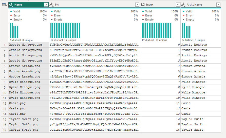
And the resulting imported images:
Final Data Model
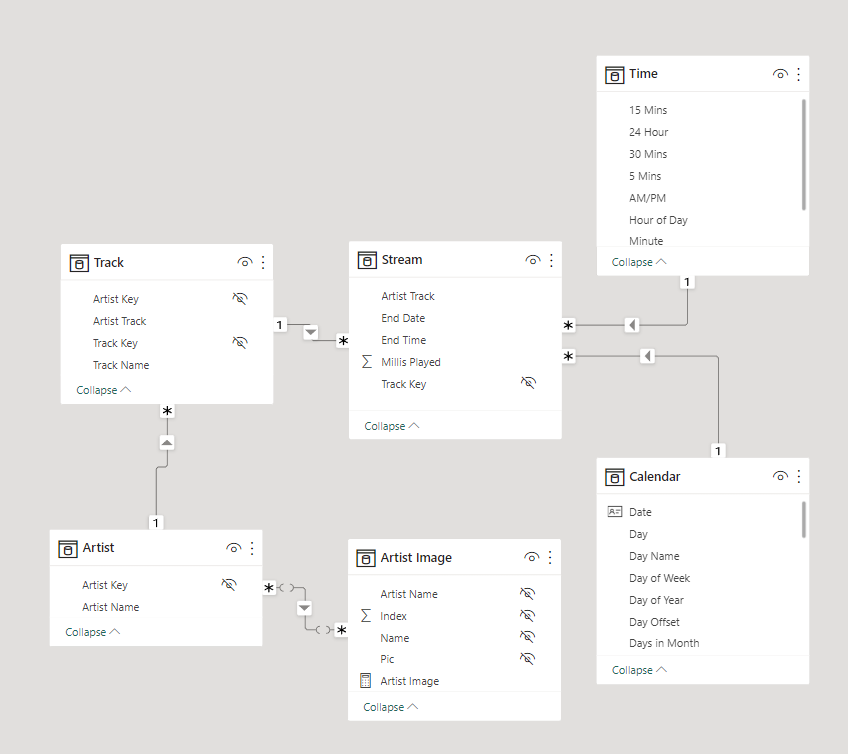
After this iteration, the final data model looks like this:
Fast Forward - The Final Result
After some initial playing with the data, I settled on a simple (and pretty bog standard) design, ending up with this.
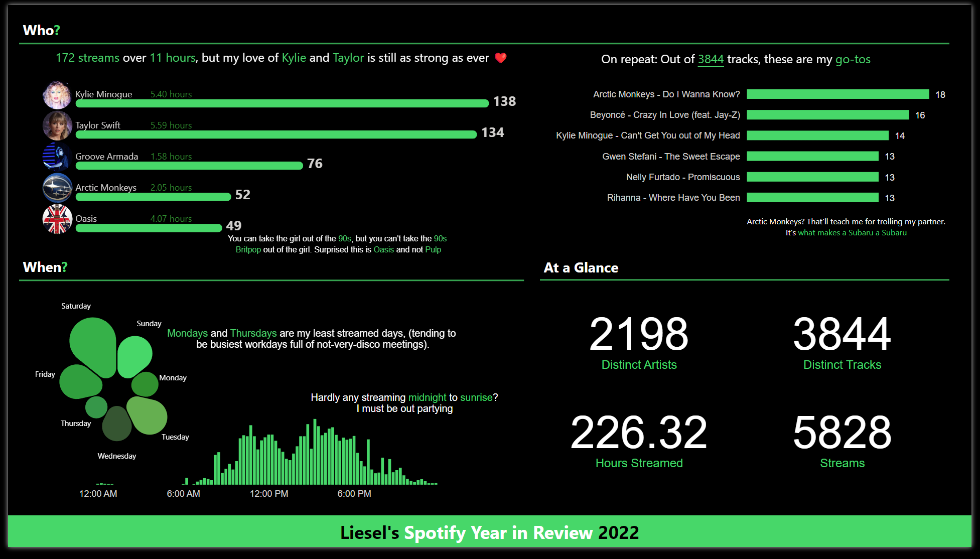
Convention says to place visuals top left to bottom right in order of importance. I thought I’d try something slightly different by using BANs in the less-important quarter hoping it would balance the natural tendency to ignore this corner. Does it work? Maybe.
The custom Deneb visuals took a little time to get almost-right, which is probably why I wanted them on the left-hand side. Yes, I know, it’s def a case of “I spent ages building this vis, so it’s going in the most prominent position”.
Let’s take the report apart.
The DAX
There’s very little DAX in this report. Most measures are counts or sum. The only one of minor interest takes the Stream Time Millis field and converts it to hours.mintues instead of decimal hours (1 hour 30 mins = 1.30 not 1.5 in other words) mostly because this makes more sense to me when displaying (although maybe 1:30 would be better still).
VAR decimalHours = [Stream Time Millis] / ( 60 * 60 * 1000 )
VAR hours =
    TRUNC ( decimalHours )
VAR decMins = ( decimalHours - hours )
RETURN
    hours + 0.6 * decMins
The Visuals
There are two Deneb visuals in this report. The first is a radial plot, and the second is the catchy titled “combo image bar stats chart”. All the others are standard Power BI visuals.
I also created a custom colour theme to “F to pay respects” to the Spotify look.
The Blobby Radial Plot
Well, I don’t know what else to call it. This one is straight forwards, Day Name from the Time dimension and Stream Time Hours from the Streams table.
{
  "data": {"name": "dataset"},
  "layer": [
    {
      "mark": {
        "type": "arc",
        "cornerRadius": 100,
        "padAngle": 0.02
      }
    },
    {
      "mark": {"type": "text", "radiusOffset": 20,
        "fontSize": 10},
      "encoding": {
        "text": {"field": "Day Name"},
        "color": {"value":"#FFFFFF"}
      }
    }
    ],
    "encoding": {
      "theta": {"field": "Day Name","stack": true, "sort":null },
      "radius": {"field": "Stream Time Hours", "scale": {
        "type": "sqrt", "zero": true, "rangeMin": 20}
      },
      "color": {"field": "Day Name","sort":null, "scale": {"scheme": "pbiColorNominal"}, "legend": null }
    }
}
I should probably go back and add cross-filtering and highlighting at some point.
The Summary Combo Image Bar Stats Chart
The awesomely titled vis is really an exercise in self-indulgent study of Deneb. I’m still very much at the “How on earth do you make this work?” stage, so this is not all a case study in Vega-lite best practice. It’s more an exercise in not admitting defeat whilst climbing that learning curve.
Marks:
- Bar: The main green bar
- Image: The artist image axis
- Text: Artist name label
- Text: Stream time label
- Text: Stream count label
The image axis was based on a Stack Overflow answer which seemed to work for the the text label positioning too. There’s probably a more elegant way to do this, and positioning of elements relative to band height especially needs fixing to make the vis responsive.
  "data": {"name": "dataset"},
  "layer": [
    {
      "mark": {
        "type": "bar",
        "tooltip": true,
        "cornerRadius": 10,
        "height": {"band": 0.3},
        "yOffset": 12
      }
    },
    {
      "transform": [
        {
          "calculate": "-6",
          "as": "axis"
        }
      ],
      "mark": {
        "type": "image",
        "height": 40,
        "width": 40
      },
      "encoding": {
        "x": {
          "field": "axis",
          "type": "quantitative"
        },
        "url": {
          "field": "Artist Image",
          "type": "nominal"
        }
      }
    },
    {
      "transform": [
        {"calculate": "0", "as": "axis"}
      ],
      "mark": {
        "type": "text",
        "align": "left"
      },
      "encoding": {
        "text": {
          "field": "Artist Name"
        },
        "x": {
          "field": "axis",
          "type": "quantitative"
        }
      }
    },
    {
      "transform": [
        {
          "calculate": "25",
          "as": "axis"
        },
        {
      "calculate": " format(datum['Stream Time Hours'],'.2f') + ' hours'",
      "as": "textValue"
    }
      ],
      "mark": {
        "type": "text",
        "align": "left",
        "color": {"expr": "pbiColor(1)"}
      },
      "encoding": {
        "text": {
          "field": "textValue"
        },
        "x": {
          "field": "axis",
          "type": "quantitative"
        }
      }
    },
    {
      "mark": {
        "type": "text",
        "fontSize": 18,
        "fontWeight": "bold",
        "align": "left",
        "dy": 10,
        "dx": 5
      },
      "encoding": {
        "text": {
          "field": "Count Streams"
        }
      }
    }
  ],
  "encoding": {
    "y": {
      "field": "Artist Name",
      "type": "nominal",
      "axis": null,
      "sort": null
    },
    "x": {
      "field": "Count Streams",
      "type": "quantitative",
      "axis": null
    }
  },
  "resolve": {"scale": {"x": "shared"}}
}
As with the radial plot, I should probably go back and add cross-filtering and highlighting.
Storytime
Finally I added a little commentary to the report, reflecting the data points that jumped out at me.
Biggest take-away? I really shouldn’t troll my partner so much with TikTok meme sound tracks. They don’t even own a Subuwu.
Unwrapped Wrapped Up
This was an enjoyable hands-on side project with some interesting learning along the way. It’s not often I get the chance to do a complete end-to-end data prep, exploratory, visualisation and report building exercise just for funsies.
And Kylie and Taylor Swift are my most streamed artists? Who knew?