
Introduction
Colour is one of the most important encoding channels in data visualisation. Reports tell the story behind the data, and colour harmony is a powerful tool to help tell that story. Yet building a consistent and compelling colour theme can be hard for a non-designer, especially if you don’t know your Tetradic from your Accented Analogous.
Tools such as Coolors or Adobe Color can help create a colour palette, but out of the context of an actual report, it’s almost impossible for a non-designer to know if the colours will produce the desired outcome.
A good a place to start for the non-designer is a mood board to help collate ideas. Inspiration can be found by searching photography sites like Pexels.com or designs on Dribbble in an attempt to capture that elusive feeling, the story the report is trying to tell. These images can be assembled in Figma (or PowerPoint) to build the board, and from there a design (and in this case, the colour theme we’re after) can begin to emerge.
But searching for inspiring images can be time consuming and frustrating, and the results are often lacking. Let’s see if AI can help in the creative process.
As much as tools like Midjourney, Stable Diffusion and DALL·E can generate impressive images, can AI really create a compelling narrative-centric reports without understanding the human context behind the data? A mockup is one thing, but a report is a living artefact that needs to be understood by humans in the context of the real world. (Can you tell I’m a Giorgia Lupi fan).
This I believe is where technology can augment, but not replace skilled UX designers.
Marco Russo touches on a similar point concerning the human context and DAX code generation: “The unsolved problem here is that the DAX language is almost meaningless without a data model. The data model is often incomplete in terms of semantics because many pieces of information cannot be inferred only by table and column names. […] the lack of context is an unresolved problem.”
Further, this naturally leads (me) to the question “Are AI generated images really art?” So What is art? And is a BI report also art?
Stable Diffusion
There’s literally hundreds of blog posts and youtube videos on UI design using AI. For example, this article compares Midjourney and DALL·E and has some handy prompt tips (always cite your sources, kids).
I’ve chosen to try out Stable Diffusion and just in case you haven’t heard of it…here’s the wikipedia entry.
I’m using DreamStudio but “Other AI image generators are available”. And if you’re wanting to do something with that RTX 4090 besides play RTX Flappy Bird here’s some github links
- https://github.com/Stability-AI
- https://github.com/Stability-AI/stablediffusion
- https://github.com/Stability-AI/StableStudio
- https://github.com/AUTOMATIC1111/stable-diffusion-webui
Prompts
“Prompt Engineering” (ugh, as someone with an actual Engineering degree, this term is super cringe) is the process of providing a text prompt to an AI model to produce or guide output. Garbage in, garbage out.
Let’s start with a simple prompt in dreamstudio.ai:
Analytics dashboard, ui/ux
OK, not too sure about the little creepy dudes, and the second image is straight out of a PowerPoint preso. Let’s try again:
Analytics dashboard, ui/ux design, wireframe
Better. It’s well know that current models struggle with text, but ignoring this, the first two designs could easily have come from the Data Stories Gallery
Let’s give it a bit more help with the theme. I fancy something pastel, so let’s try:
Analytics dashboard, ui/ux design, wireframe, pastel
Not bad, not bad. Perhaps a bit more pink and prettier?
Analytics dashboard, ui/ux design, wireframe, pastel, pink, beautiful, subtle
I really like the first one, but perhaps it’s starting to get a little bit too arty??
Let’s try asking for something that’s a little less pretty and looks like it’s been made in Figma:
Analytics dashboard, ui/ux design, wireframe, pastels, pink, Figma
Again, the first result looks like a typical Gallery report, so pretty good. The second? Well, Stable Diffusion really does love the idea of mountains, and to be honest, I kind of like that idea too.
One last go.
Analytics dashboard, ui/ux design, wireframe, pastels, pink, light theme, Figma
I’ve no idea why this prompt added presenters, but the overall report designs aren’t bad at all.
Figma Mood Board
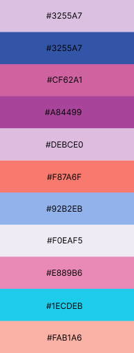
Here I’ve taken my fav four designs and pasted into Figma. As each of these designs captures partly the mood I’m aiming for, I’m hoping extracting a palette from each will help me carry that mood into my report. The Color Thief plug-in makes this easy.
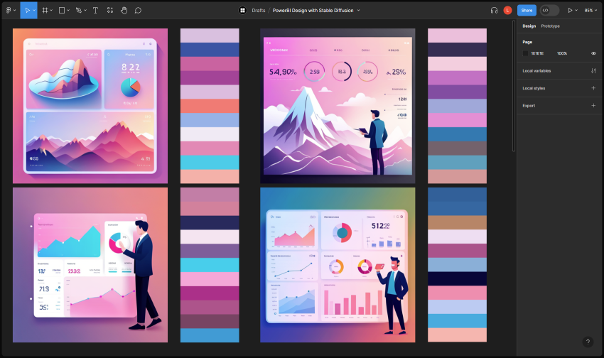
Any one of these palettes would be a reasonable starting point, and in a more complete design we would wireframe out the report in Figma and tweak each colour before exporting to a PBI theme. But for now, let’s just pick one and use it as-is in Power BI desktop.
Theming the Report
Let’s test out the palette on a report. Here’s the basic Revenue Opportunities pbix from the Power BI Desktop Samples repo.
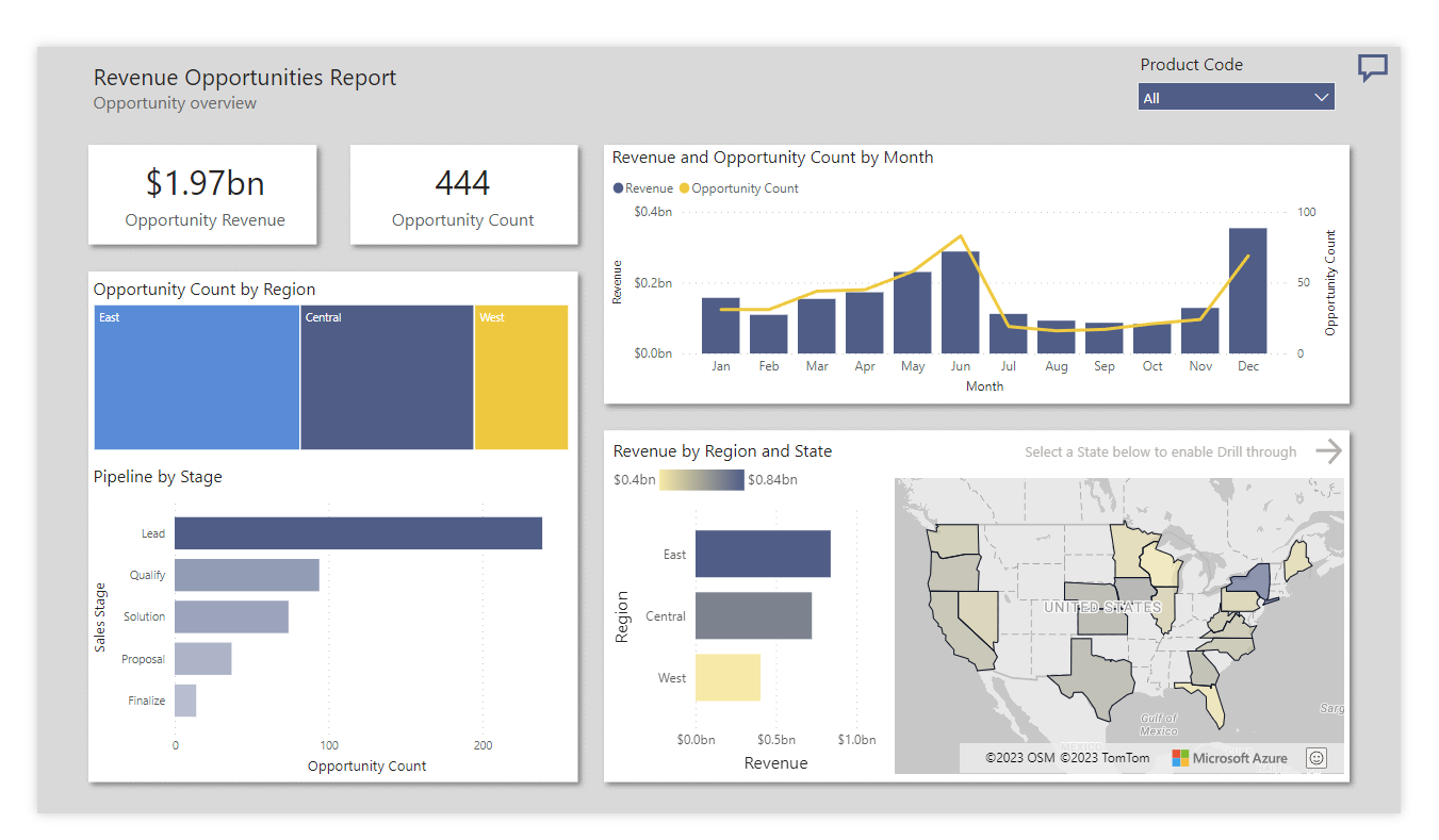
Why would I want a pastel themed revenue opportunities report Liesel? Glad you asked. Doesn’t the sales team deserve a little beauty in their lives? But really, I’m actually working on a personal little side-gig report at the moment that I want pastel themed.
Resetting all of the formatting back to default and copying colours from our palette in the theme editor gives us this:

Besides the grey Azure map vis, this is giving me the vibe I’m looking for for my top-secret-side-project. From here, the next step would be to add a nice background in Figma, export the colours to a theme and then refine the report. But that’s for next time.