
Intro : Deneb, Vega, Vega-Lite, Vega-Altair
Deneb
Deneb, is a certified custom visual for Power BI that allows us to build our own visuals using the Vega/Vega-Lite syntax. Ever wanted to do a Frankenstein bubble-pie plot in Power BI? Me neither. But even though Power BI has a large library of custom visuals, there are times when we just need something more. Something like these rather neat visuals
Deneb, is a super easy way to create these bespoke visualisations, and since the Visual is certified, it’s an awesome tool for corporate peeps.
Vega & Vega-Lite
From the Vega and Vega-lite docs:
Vega is a visualization grammar, a declarative language for creating, saving, and sharing interactive visualization designs. With Vega, you can describe the visual appearance and interactive behavior of a visualization in a JSON format, and generate web-based views using Canvas or SVG.
Vega-Lite is a high-level grammar of interactive graphics. It provides a concise, declarative JSON syntax to create an expressive range of visualizations for data analysis and presentation.
Splendid. Yet more JSON. I’m old skool, was brought up to trust the compiler, and I feel more at home in code than in config-that-wants-to-be-code. And I’m not alone:
XML was never my scene and I don’t like JSON
— Freddie Mercury, C++ dev
Vega-Altair
But, there’s hope. Vega-Altair effectively wraps Vega/Vega-lite in a Python API. Ok, it’s not Turbo Pascal, but hey…
Vega-Altair is a declarative statistical visualization library for Python, based on Vega and Vega-Lite.
With Vega-Altair, you can spend more time understanding your data and its meaning. Altair’s API is simple, friendly and consistent and built on top of the powerful Vega-Lite visualization grammar. This elegant simplicity produces beautiful and effective visualizations with a minimal amount of code.
Spend more time understanding your data? I like the sound of that. Let’s find a rabbit hole to disappear down.
Let’s Code Stuff
The Pointy Bit
So, finally we get to the point of today’s post:
- Deneb is a visual hosted in Power BI Desktop.
- Deneb binds to a Power BI dataset like any other visual.
- The Deneb editor is OK, but it’s not VS Code.
- I really don’t like hand-writing JSON.
So, if Altair let’s us write Python instead of JSON, and Python has a TOM wrapper, why can’t we use that to rapidly prototype a visual, using the same data binding we’ll be using in Power BI Desktop, but with the wonderful productivity tools in VS Code like VS Code Pets?
Start At The Very Beginning
As the point of the exercise is to look at how we can build a simple dev process rather than a super flash viz, I’m going to begin with the Adventure Works Sales Sample
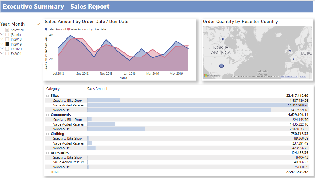
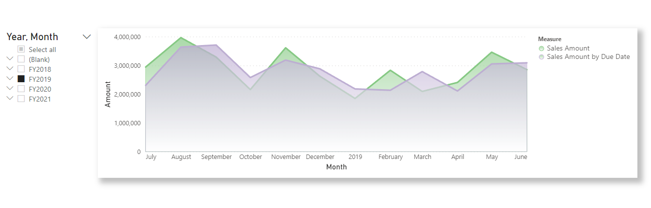
The area chart in the top left is pretty easy, let’s see if we can reproduce that.
Just The Basic DAX
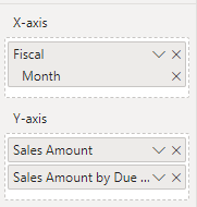
First up, this chart has bindings to the Month in Fiscal Year dimension and two measures: Sales Amount and Sales Amount By Due Date
Behind the scenes, Power BI will run some DAX to provide the visual with a table of values for these fields. We could capture this using performance analyzer, but as this is a simple summary, we can just write the query and test it in DAX studio.
Notice the slicer in the report, we’ll replicate that in our DAX too, just to keep data volumes teeny.
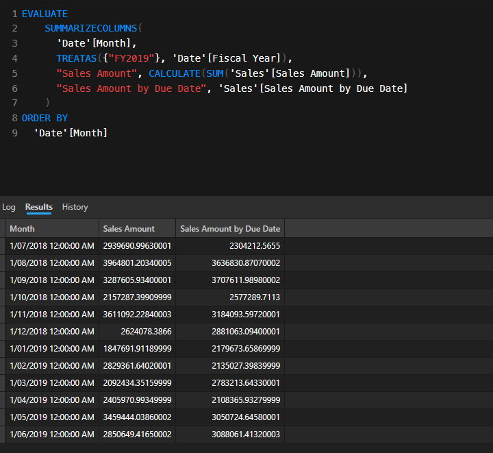
Looks good. Now we know what DAX we need to run to feed our snakey vis.
Python & TOM
Next, we’re going to need to run that DAX in Python.
Setup
This repo provides a wrapper for the TOM .net API in Python. I already had the Analysis Services client libraries installed in the GAC, (Microsoft.AnalysisServices.retail.amd64 and Microsoft.AnalysisServices.AdomdClient.retail.amd64) so didn’t need to follow the install notes. I’ve cloned the repo into a sub-folder so my script can find it.
Finding The Desktop Port
Power BI Desktop randomises ports on each startup. We can find the current port using Powershell
Get-NetTcpConnection -OwningProcess $(Get-Process msmdsrv).Id -State Listen
(Or you can use DAX studio, Tabular Editor, ask Twitter etc)
We should now be ready to jump into Python.
Python Time
All the code below can be found in this notebook.
Deps
Install these, you’ll thank me later:
pip install pythonnet
pip install seaborn
pip install altair
pip install dpath
Loading Data
First we need to connect to Power BI Desktop. We’ll append the python-ssas folder to the path so our script can find it.
The ssas_api wrapper will lazy auto-load TOM assemblies on first use, but let’s be explicit
import sys
sys.path.append(os.path.abspath("python-ssas"))

import pandas as pd
import altair as alt
import ssas_api as ssas

ssas._load_assemblies()
Next we can connect to Desktop.
import System
from   System.Data import DataTable
import Microsoft.AnalysisServices.Tabular as TOM
import Microsoft.AnalysisServices.AdomdClient as ADOMD


conn = ssas.set_conn_string(
    server="localhost:63045",
    db_name="",
    username="",
    password=""
    )

TOMServer = TOM.Server()
TOMServer.Connect(conn)
print("Connection Successful.")
For a local connection, the db_name, username and password can be left blank. Set the port to the value discovered above.
We can now run our DAX
qry = """
EVALUATE
    SUMMARIZECOLUMNS(
      'Date'[Month],
      TREATAS({"FY2019"}, 'Date'[Fiscal Year]),
      "Sales Amount", CALCULATE(SUM('Sales'[Sales Amount])),
      "Sales Amount by Due Date", 'Sales'[Sales Amount by Due Date]
    )
ORDER BY
  'Date'[Month]
"""


df = (ssas.get_DAX(
         connection_string=conn,
         dax_string=qry)
    )

df.head()

Those column names are annoying. Lets clean them up and also convert the Month to a proper datetime
df.columns = [ 'Month' , 'Sales Amount', 'Sales Amount by Due Date' ]
df['Month'] = pd.to_datetime(df['Month'])

df.head()
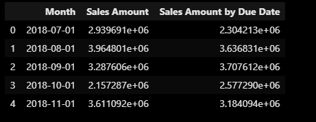
That’s better.
Altair
Shaping Data
Altair favours long-form data over the wide-form we have. There are two options to reshaping - melt in Pandas or using Altair’s transform_fold transformation.
Unstacked Area Two Ways
First, let’s melt into long format:
df_long = df.melt(id_vars='Month', var_name='Measure', value_name='Value')
We can now build a simple chart
chart = alt.Chart(df_long
    ).mark_area(
        opacity=0.3,
        line = alt.LineConfig(opacity=1)
    ).encode(
        x='Month:T',
        y=alt.Y('Value:Q',stack=None),
        color='Measure:N'
    )

chart
This will give us:
However, Power BI will give us wide data that we won’t be able to melt so let’s try plan B:
chart = alt.Chart(df
    ).transform_fold (
        list(df.columns[1:]),
        as_=['Measure', 'Value']
    ).mark_area(
        opacity=0.3,
        line = alt.LineConfig(opacity=1)
    ).encode(
        x='Month',
        y=alt.Y('Value:Q',stack=None),
        color='Measure:N'
    )

chart
Notice the transform_fold function where we take a list of columns from our dataframe and pivot these into Measure/Value pairs? We’re already using Python to not have to hardcode this metadata. Nice
Here’s the output
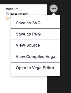
You can use the menu to view the Vega or open in the Vega editor if you want to play with the code
Changing Colours
The default colours are OK, but what if we want to change them? We can use repeated charts
colours = [ '#7fc97f', '#beaed4']

chart = alt.Chart(df
    ).mark_area(
        opacity=0.5,
        line = alt.LineConfig(opacity=1)
    ).encode(
        x=alt.X('Month', type='temporal', title='Month'),
        y=alt.Y(alt.repeat("layer"),type='quantitative', stack=None),
        color=alt.ColorDatum(alt.repeat("layer"))
    ).repeat(
        layer=list(df.columns[1:])
    ).configure_range(
        category=alt.RangeScheme(colours)
    )

chart
Gradient Fills
Who doesn’t love a gradient fill?
chart = alt.Chart(df
    ).transform_fold(
        list(df.columns[1:]),
        as_=['Measure', 'Value']
    ).transform_filter(
            f'datum.Measure==="Sales Amount"'
    ).mark_area(
            line = alt.LineConfig(opacity=1, color="red"),
            color=alt.Gradient(
            gradient='linear',
            stops=[
                alt.GradientStop(color='white', offset=0),
                alt.GradientStop(color='red', offset=1)
            ],
            x1=1,
            x2=1,
            y1=1,
            y2=0
        )
    ).encode(
        x=alt.X('Month', type='temporal', title='Month'),
        y=alt.Y('Value',type='quantitative', title='Amount'),
    )

chart
However, this is OK for a single series, but for multiple series, we need to layer charts (From my playing, it appears that color in encode overrides color in mark_area but doesn’t accept gradients?)
This is where the power of Python really helps us out. This is still a very simple example but would be getting tricky to hand code in Vega-Lite JSON. But we can abstract out the code for each layer, then composite as we iterate over our dataframe’s metadata. Too easy
First, a function to make a gradient chart
def make_gradient_chart(chart, col, colour):
    return  chart.transform_filter(
             f'datum.Measure==="{col}"'
        ).mark_area(
              line = alt.LineConfig(opacity=1, color=colour),
              color=alt.Gradient(
                gradient='linear',
                stops=[
                    alt.GradientStop(color='white', offset=0),
                    alt.GradientStop(color=colour, offset=1)
                ],
                x1=1,
                x2=1,
                y1=1,
                y2=0
            )
        ).encode(
            alt.Stroke(
                'Measure:O',
            scale=alt.Scale(
                domain=measureCols,
                range=colours
                )
            )
        )
Now we’ll make a base chart with data binding that we can then pass to our function to decorate with gradient goodness.
colours = [ '#7fc97f', '#beaed4']
measureCols = list(df.columns[1:])

base = alt.Chart(df
    ).transform_fold(
        measureCols,
        as_=['Measure', 'Value']
    ).encode(
        x=alt.X('Month', type='temporal', title='Month'),
        y=alt.Y('Value',type='quantitative', title='Amount')
    )
Now we can just iterate over our measure columns, generating a new layer for each and composite into a new layer chart.
chart = alt.layer(
    *[make_gradient_chart(
        base,
        df.columns[n],
        colours[n-1])
      for n in range(1, df.shape[1])
      ]
)


chart
Clean Up
Before we can use the generated Vega JSON in Deneb, we need to clean up a few things. If you look at any of the Vega from the above charts, you’ll see the dataset is embedded. For Power BI, we need to remove this dataset and set the datasource to dataset We also need to remove the schema definition. dpath (https://github.com/dpath-maintainers/dpath-python) makes this easy:
import json
import dpath.util as dpath

dict = chart.to_dict()

dpath.set(dict, '**/data/name', 'dataset')
dpath.delete(dict, 'datasets')
dpath.delete(dict, '$schema')

with open("chart.json", "w") as fp:
    json.dump(dict , fp, indent = 4)
We now have a json file that we can copy and paste into Deneb in Power BI:
Acknowledgements
Thanks to Kerry Kolosko for the feedback and for recommending Sandeep Pawar’s tutorial on Jupyter, Altair and Deneb (wish I’d watched that before I got stuck into the code).